ShopDreamUp AI ArtDreamUp
Deviation Actions


Suggested Deviants


Suggested Collections
![She's the Bad Guy [UT Lyric Strip]](https://images-wixmp-ed30a86b8c4ca887773594c2.wixmp.com/f/5b6c36ca-3201-433f-8c29-0b2b490655f3/d9uoxok-0238a16d-c34e-4197-9bfa-4566db337c46.png/v1/crop/w_184,h_184,x_0,y_153,scl_0.184/she_s_the_bad_guy__ut_lyric_strip__by_d2dm_fanfic_d9uoxok-92s-2x.png?token=eyJ0eXAiOiJKV1QiLCJhbGciOiJIUzI1NiJ9.eyJzdWIiOiJ1cm46YXBwOjdlMGQxODg5ODIyNjQzNzNhNWYwZDQxNWVhMGQyNmUwIiwiaXNzIjoidXJuOmFwcDo3ZTBkMTg4OTgyMjY0MzczYTVmMGQ0MTVlYTBkMjZlMCIsIm9iaiI6W1t7ImhlaWdodCI6Ijw9NDMzNCIsInBhdGgiOiJcL2ZcLzViNmMzNmNhLTMyMDEtNDMzZi04YzI5LTBiMmI0OTA2NTVmM1wvZDl1b3hvay0wMjM4YTE2ZC1jMzRlLTQxOTctOWJmYS00NTY2ZGIzMzdjNDYucG5nIiwid2lkdGgiOiI8PTEwMDAifV1dLCJhdWQiOlsidXJuOnNlcnZpY2U6aW1hZ2Uub3BlcmF0aW9ucyJdfQ.TYBeq86op4Vy0EfCGGGd9fup8vtQ1MBzE4ZkuSRHhEY)
![She's the Bad Guy [UT Lyric Strip]](https://images-wixmp-ed30a86b8c4ca887773594c2.wixmp.com/f/5b6c36ca-3201-433f-8c29-0b2b490655f3/d9uoxok-0238a16d-c34e-4197-9bfa-4566db337c46.png/v1/crop/w_92,h_92,x_0,y_77,scl_0.092/she_s_the_bad_guy__ut_lyric_strip__by_d2dm_fanfic_d9uoxok-92s.png?token=eyJ0eXAiOiJKV1QiLCJhbGciOiJIUzI1NiJ9.eyJzdWIiOiJ1cm46YXBwOjdlMGQxODg5ODIyNjQzNzNhNWYwZDQxNWVhMGQyNmUwIiwiaXNzIjoidXJuOmFwcDo3ZTBkMTg4OTgyMjY0MzczYTVmMGQ0MTVlYTBkMjZlMCIsIm9iaiI6W1t7ImhlaWdodCI6Ijw9NDMzNCIsInBhdGgiOiJcL2ZcLzViNmMzNmNhLTMyMDEtNDMzZi04YzI5LTBiMmI0OTA2NTVmM1wvZDl1b3hvay0wMjM4YTE2ZC1jMzRlLTQxOTctOWJmYS00NTY2ZGIzMzdjNDYucG5nIiwid2lkdGgiOiI8PTEwMDAifV1dLCJhdWQiOlsidXJuOnNlcnZpY2U6aW1hZ2Uub3BlcmF0aW9ucyJdfQ.TYBeq86op4Vy0EfCGGGd9fup8vtQ1MBzE4ZkuSRHhEY)


![Memory [UNDERTALE SPOILERS]](https://images-wixmp-ed30a86b8c4ca887773594c2.wixmp.com/f/57c0d81c-ae67-494d-b52a-26282df7f889/d9q7sc6-f7105eef-1de2-42e8-88f8-946aebcaa345.png/v1/crop/w_184,h_184,x_0,y_108,scl_0.26285714285714,q_70,strp/memory__undertale_spoilers__by_pettyartist_d9q7sc6-92s-2x.jpg?token=eyJ0eXAiOiJKV1QiLCJhbGciOiJIUzI1NiJ9.eyJzdWIiOiJ1cm46YXBwOjdlMGQxODg5ODIyNjQzNzNhNWYwZDQxNWVhMGQyNmUwIiwiaXNzIjoidXJuOmFwcDo3ZTBkMTg4OTgyMjY0MzczYTVmMGQ0MTVlYTBkMjZlMCIsIm9iaiI6W1t7ImhlaWdodCI6Ijw9MjM0MSIsInBhdGgiOiJcL2ZcLzU3YzBkODFjLWFlNjctNDk0ZC1iNTJhLTI2MjgyZGY3Zjg4OVwvZDlxN3NjNi1mNzEwNWVlZi0xZGUyLTQyZTgtODhmOC05NDZhZWJjYWEzNDUucG5nIiwid2lkdGgiOiI8PTcwMCJ9XV0sImF1ZCI6WyJ1cm46c2VydmljZTppbWFnZS5vcGVyYXRpb25zIl19.unPvdE9XaIabSJRpvXRVtvF5u8OD6yvdfzNxX1ZxBjc)
![Memory [UNDERTALE SPOILERS]](https://images-wixmp-ed30a86b8c4ca887773594c2.wixmp.com/f/57c0d81c-ae67-494d-b52a-26282df7f889/d9q7sc6-f7105eef-1de2-42e8-88f8-946aebcaa345.png/v1/crop/w_92,h_92,x_0,y_54,scl_0.13142857142857,q_70,strp/memory__undertale_spoilers__by_pettyartist_d9q7sc6-92s.jpg?token=eyJ0eXAiOiJKV1QiLCJhbGciOiJIUzI1NiJ9.eyJzdWIiOiJ1cm46YXBwOjdlMGQxODg5ODIyNjQzNzNhNWYwZDQxNWVhMGQyNmUwIiwiaXNzIjoidXJuOmFwcDo3ZTBkMTg4OTgyMjY0MzczYTVmMGQ0MTVlYTBkMjZlMCIsIm9iaiI6W1t7ImhlaWdodCI6Ijw9MjM0MSIsInBhdGgiOiJcL2ZcLzU3YzBkODFjLWFlNjctNDk0ZC1iNTJhLTI2MjgyZGY3Zjg4OVwvZDlxN3NjNi1mNzEwNWVlZi0xZGUyLTQyZTgtODhmOC05NDZhZWJjYWEzNDUucG5nIiwid2lkdGgiOiI8PTcwMCJ9XV0sImF1ZCI6WyJ1cm46c2VydmljZTppbWFnZS5vcGVyYXRpb25zIl19.unPvdE9XaIabSJRpvXRVtvF5u8OD6yvdfzNxX1ZxBjc)


![[UNDERTALE SPOILERS] it'll be okay](https://images-wixmp-ed30a86b8c4ca887773594c2.wixmp.com/f/f4ac8243-286f-454f-936f-825e03f77696/d9ddsrs-ad2b6bad-54d9-48a8-9f0c-dbdcd4f2f56e.png/v1/crop/w_184,h_184,x_0,y_279,scl_0.34074074074074,q_70,strp/_undertale_spoilers__it_ll_be_okay_by_zarla_d9ddsrs-92s-2x.jpg?token=eyJ0eXAiOiJKV1QiLCJhbGciOiJIUzI1NiJ9.eyJzdWIiOiJ1cm46YXBwOjdlMGQxODg5ODIyNjQzNzNhNWYwZDQxNWVhMGQyNmUwIiwiaXNzIjoidXJuOmFwcDo3ZTBkMTg4OTgyMjY0MzczYTVmMGQ0MTVlYTBkMjZlMCIsIm9iaiI6W1t7ImhlaWdodCI6Ijw9MzgxMCIsInBhdGgiOiJcL2ZcL2Y0YWM4MjQzLTI4NmYtNDU0Zi05MzZmLTgyNWUwM2Y3NzY5NlwvZDlkZHNycy1hZDJiNmJhZC01NGQ5LTQ4YTgtOWYwYy1kYmRjZDRmMmY1NmUucG5nIiwid2lkdGgiOiI8PTU0MCJ9XV0sImF1ZCI6WyJ1cm46c2VydmljZTppbWFnZS5vcGVyYXRpb25zIl19.I8S3shExS547Nz3C8ks4_P9_rkP3fO89pSKeMOma5XY)
![[UNDERTALE SPOILERS] it'll be okay](https://images-wixmp-ed30a86b8c4ca887773594c2.wixmp.com/f/f4ac8243-286f-454f-936f-825e03f77696/d9ddsrs-ad2b6bad-54d9-48a8-9f0c-dbdcd4f2f56e.png/v1/crop/w_92,h_92,x_0,y_139,scl_0.17037037037037,q_70,strp/_undertale_spoilers__it_ll_be_okay_by_zarla_d9ddsrs-92s.jpg?token=eyJ0eXAiOiJKV1QiLCJhbGciOiJIUzI1NiJ9.eyJzdWIiOiJ1cm46YXBwOjdlMGQxODg5ODIyNjQzNzNhNWYwZDQxNWVhMGQyNmUwIiwiaXNzIjoidXJuOmFwcDo3ZTBkMTg4OTgyMjY0MzczYTVmMGQ0MTVlYTBkMjZlMCIsIm9iaiI6W1t7ImhlaWdodCI6Ijw9MzgxMCIsInBhdGgiOiJcL2ZcL2Y0YWM4MjQzLTI4NmYtNDU0Zi05MzZmLTgyNWUwM2Y3NzY5NlwvZDlkZHNycy1hZDJiNmJhZC01NGQ5LTQ4YTgtOWYwYy1kYmRjZDRmMmY1NmUucG5nIiwid2lkdGgiOiI8PTU0MCJ9XV0sImF1ZCI6WyJ1cm46c2VydmljZTppbWFnZS5vcGVyYXRpb25zIl19.I8S3shExS547Nz3C8ks4_P9_rkP3fO89pSKeMOma5XY)
You Might Like…


![[UT] Do It](https://images-wixmp-ed30a86b8c4ca887773594c2.wixmp.com/f/c8d290e3-45d2-4c50-8505-905c5ecf6b76/dckjoh1-4b801c72-167e-4f07-ae7a-07935d7c9e38.png/v1/crop/w_184,h_184,x_0,y_0,scl_0.046,q_70,strp/_ut__do_it_by_sisterbrinetempacc_dckjoh1-92s-2x.jpg?token=eyJ0eXAiOiJKV1QiLCJhbGciOiJIUzI1NiJ9.eyJzdWIiOiJ1cm46YXBwOjdlMGQxODg5ODIyNjQzNzNhNWYwZDQxNWVhMGQyNmUwIiwiaXNzIjoidXJuOmFwcDo3ZTBkMTg4OTgyMjY0MzczYTVmMGQ0MTVlYTBkMjZlMCIsIm9iaiI6W1t7ImhlaWdodCI6Ijw9MTAyNCIsInBhdGgiOiJcL2ZcL2M4ZDI5MGUzLTQ1ZDItNGM1MC04NTA1LTkwNWM1ZWNmNmI3NlwvZGNram9oMS00YjgwMWM3Mi0xNjdlLTRmMDctYWU3YS0wNzkzNWQ3YzllMzgucG5nIiwid2lkdGgiOiI8PTEwMjQifV1dLCJhdWQiOlsidXJuOnNlcnZpY2U6aW1hZ2Uub3BlcmF0aW9ucyJdfQ.YPgXkuW546auC1H4hNFK0ypQdr6VzwMx-w8YMycAPjM)
![[UT] Do It](https://images-wixmp-ed30a86b8c4ca887773594c2.wixmp.com/f/c8d290e3-45d2-4c50-8505-905c5ecf6b76/dckjoh1-4b801c72-167e-4f07-ae7a-07935d7c9e38.png/v1/crop/w_92,h_92,x_0,y_0,scl_0.023,q_70,strp/_ut__do_it_by_sisterbrinetempacc_dckjoh1-92s.jpg?token=eyJ0eXAiOiJKV1QiLCJhbGciOiJIUzI1NiJ9.eyJzdWIiOiJ1cm46YXBwOjdlMGQxODg5ODIyNjQzNzNhNWYwZDQxNWVhMGQyNmUwIiwiaXNzIjoidXJuOmFwcDo3ZTBkMTg4OTgyMjY0MzczYTVmMGQ0MTVlYTBkMjZlMCIsIm9iaiI6W1t7ImhlaWdodCI6Ijw9MTAyNCIsInBhdGgiOiJcL2ZcL2M4ZDI5MGUzLTQ1ZDItNGM1MC04NTA1LTkwNWM1ZWNmNmI3NlwvZGNram9oMS00YjgwMWM3Mi0xNjdlLTRmMDctYWU3YS0wNzkzNWQ3YzllMzgucG5nIiwid2lkdGgiOiI8PTEwMjQifV1dLCJhdWQiOlsidXJuOnNlcnZpY2U6aW1hZ2Uub3BlcmF0aW9ucyJdfQ.YPgXkuW546auC1H4hNFK0ypQdr6VzwMx-w8YMycAPjM)


Featured in Groups


Description
I think it's safe to say I'm getting better at drawing ") either that, or I've finally found my "style" (if you get me). Anyways, quite pleased with how this turned out, despite it taking 8 hours
either that, or I've finally found my "style" (if you get me). Anyways, quite pleased with how this turned out, despite it taking 8 hours  I think I'll be doing drawings in this style from now on, hopefully you guys won't mind
 ")
I think I'll be doing drawings in this style from now on, hopefully you guys won't mind Image size
2292x3125px 606.42 KB
© 2016 - 2024 Beanst3r
Comments13
Join the community to add your comment. Already a deviant? Log In
Hey there, friend! I'm here as a part of the ProjectComment Comment Tag. XD
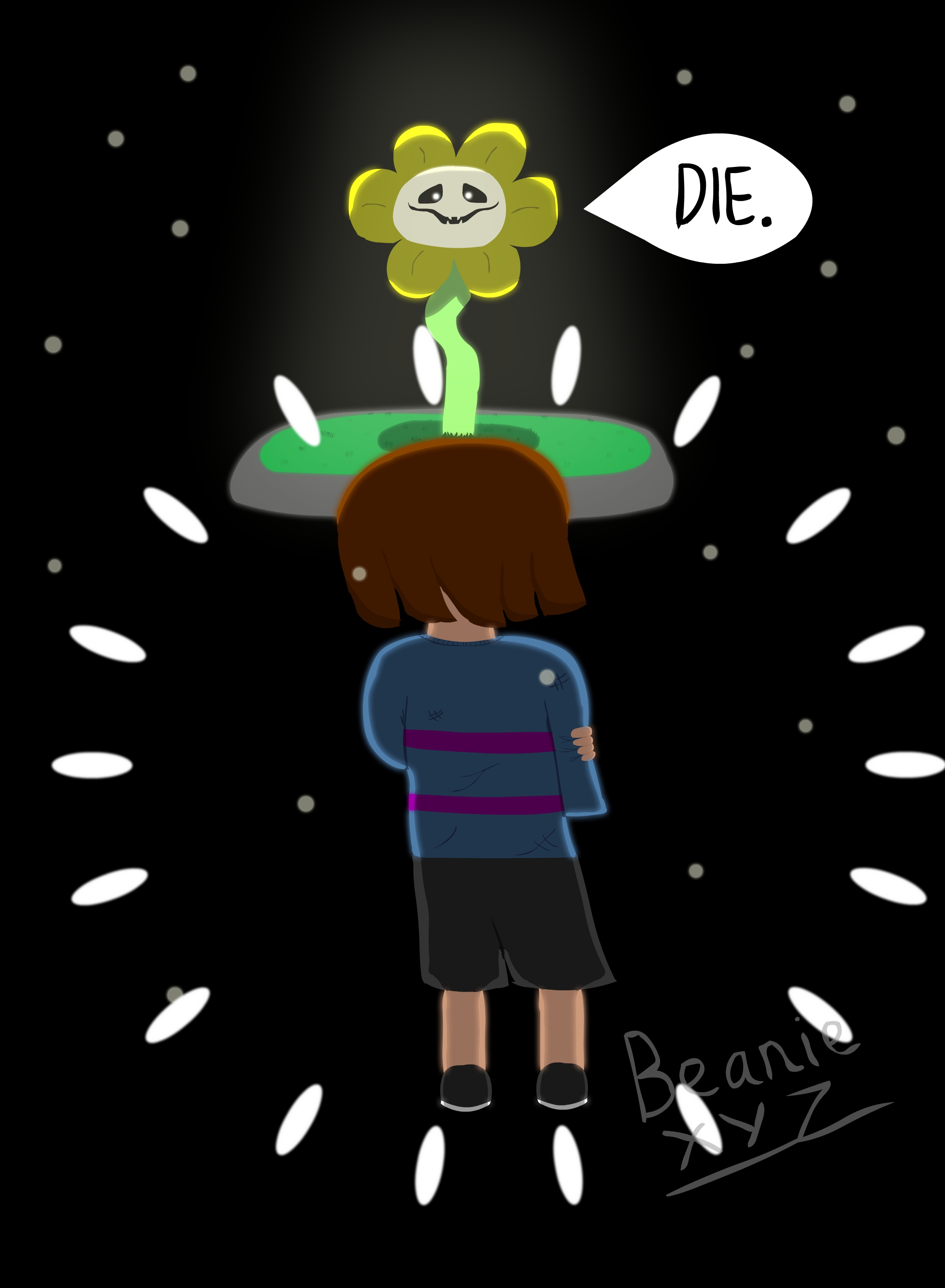
My tag was Nature and I guess Flowey sort of counts... right? ;D *cough cough Alphys*
Anyway, personally being a fan of everyone's favourite sociopathic flower myself, I just couldn't help but comment on this! #friendlinesspellets
Your line-art is really good and your shadows are accurately depicted. Your colour choice is great and the tones you've decided to use really stand out against the background - creating a good focus point for the piece. The grey dots you've included in the background were also a good choice, without them I feel that the picture would've looked quite bare. I also particularly admire how you've illustrated Flowey, his face is surprisingly difficult to draw but you've done it really well, the facial expression is spot-on to the canon in my opinion. Perfectly creepy - exactly what I'd imagine for him in this quality!
My only critique is with Frisk's composition, I'm definitely not saying that it's bad or anything - I really like it - but there's something a little off with their arms and legs. Their right arm almost looks unattached because it doesn't curl to the front or show any of their arm / hand. I think it would've looked more natural if you had altered the arm placement a little. So, nothing too much to pick at - just something to keep in mind when working on future projects.
Overall though, I really like this X3
You've definitely got yourself another watcher! XD